Painting a Red and Green Apple in Oil
wet in Wet Demonstration
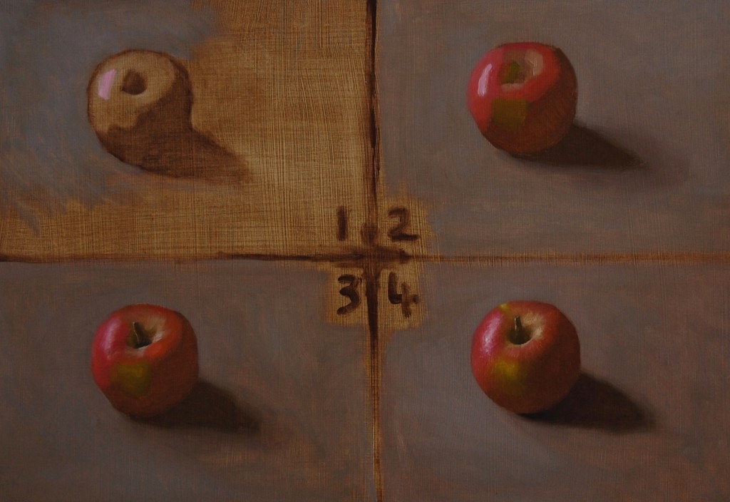
In terms of colour and values, painting red and green apples is good preparation for portraiture. The red-green transitions on an apple somewhat mimic the local colouring shifts found on the nose, ears and cheeks of a human face and the difficulties presented by this can be overcome through the practice of painting a red-green apple or pear, a model that stays perfectly still and that you can eat for lunch.
1) Raw umber wash drawing stage:
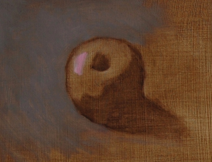
I add a small amount of odourless turpentine to a small amount of Raw Umber, mixing together with a palette knife. I then proceed to draw with a brush, using a small amount of this mixture, finding a basic outline and scrubbing in the shadow shape and cast shadow. I constantly compare the apple to my painting, looking to correct any inaccuracies.
Using straight lines to better identify the structure and comparing the width of the shadow shapes to the light shapes, I move towards more accurate proportions. Kitchen towel makes do as an eraser.
I then add my highest light in the composition to better see how bright I can ultimately go to if I want the painting to be as bright as possible in the lights (halftones, lights and highlights). I often mix approximate colour mixtures for the entire painting with a palette knife. The colours and values of what I am painting are assessed in relation to each other. One can’t just ‘copy’ the colours and values that one sees. Pigment has a more limited value and colour range than is usually seen in nature. To capture the overall light effect, one must learn to simplify values, especially in the shadows and to separate light from dark.
I thinly paint a basic background colour to create somewhat of a context for the apple and to further clarify the drawing. Squinting helps to determine the right value.
2) Blocking in the masses
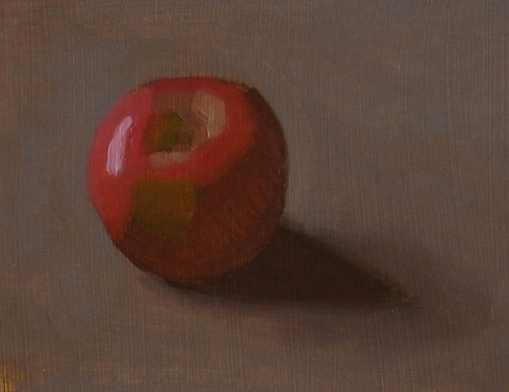
I paint the most chromatic (colourful) parts at full intensity in order to key the colour. Thereafter no colours in my composition can be more chromatic than my key, in the same way that no value can be higher than the highest light, already established.
I paint the planes of the apple in a colour and value that best represents that plane, looking to describe the structure of the apple as a whole, paying attention to where the shadow meets the halftone. Each value and colour is dependent on those around them.
Keeping things broad and simple, I cover the panel to create a loose visual impression, further correcting the drawing as I go.
3) Further refining form
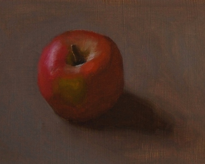
I correct any false values that jump out as not fitting in with the overall impression, before breaking down the large planes into smaller ones, if desired.
Further correcting the drawing as I go, I also define my edges, painting the contour of the apple as it meets the background harder (more abruptly) or softer (less abruptly) depending on what I see. For instance, the side of the apple appears harder where it overlaps the cast shadow. The cast shadow is painted more softly the further away it gets from the apple. One can create a soft edge by adding an additional intermediate value, blending across forms (make sure to restate the form if you do this), dragging the brush to overlap a previous brushstroke, with a loaded or empty brush, finger or palette knife or any other way you want.
If there is too much paint down where I need to make a correction, scraping with a palette knife or using kitchen towel to remove excess paint can prove indispensable useful.
4) Finishing
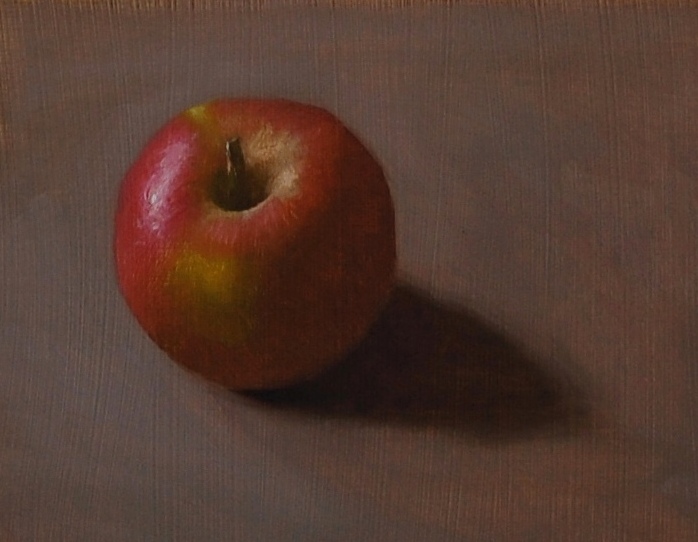
Looking to simplify and reinforce any values or colours by further repainting on top.
I add detail, or simplify throughout the composition, depending on what I am after. For instance, I could have left the shadows as one flat value (see stage 3), but in this instance I introduced a small amount of reflected light into the shadow, squinting to determine how unified they should be. Too much reflected light will weaken the sense of the unified light impression. Our eyes adjust and let in more light when looking into the shadows.